How to Choose the Right Filter Layout for a Better Shopping Experience
Let’s say a shopper lands on your store and starts browsing. They like what they see, but now they want to narrow it down. Maybe just shoes. Or only items under $50. If the filters aren’t right where they expect them to be, they may give up.
That’s why filter layout is more than just a design choice. It’s a real part of your customer’s journey, and if it feels clunky, they leave. The way your filters are placed can directly shape how fast a customer finds what they want, and how likely they are to buy.
So in Fynq, we’ve made it simple to set up filter layout positions that suit your store and your customers.
Table of Contents:
Exploring layout options inside Fynq
You’ll find this inside the Fynq app under:
Configuration → Search Result Page → Filter Position Layout
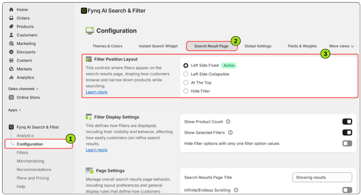
Here, you’ll see four layout choices for where your filters appear on the search result page:
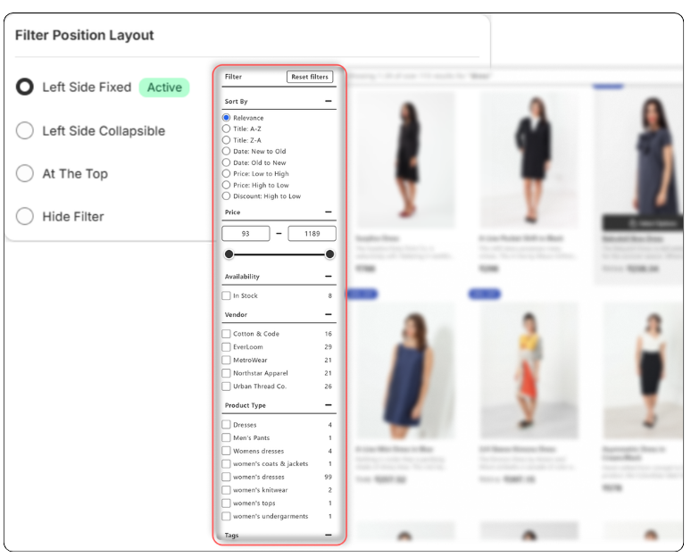
- Left Side Fixed – Filters stay locked on the left side of the screen as your customers scroll. It’s reliable and always visible, which works well for stores with lots of product options.
- Left Side Collapsible – This is a cleaner option. Filters still sit on the left, but customers can expand or collapse them by clicking on the Filter button on the left. Great if you want a tidier look without removing the filter utility.
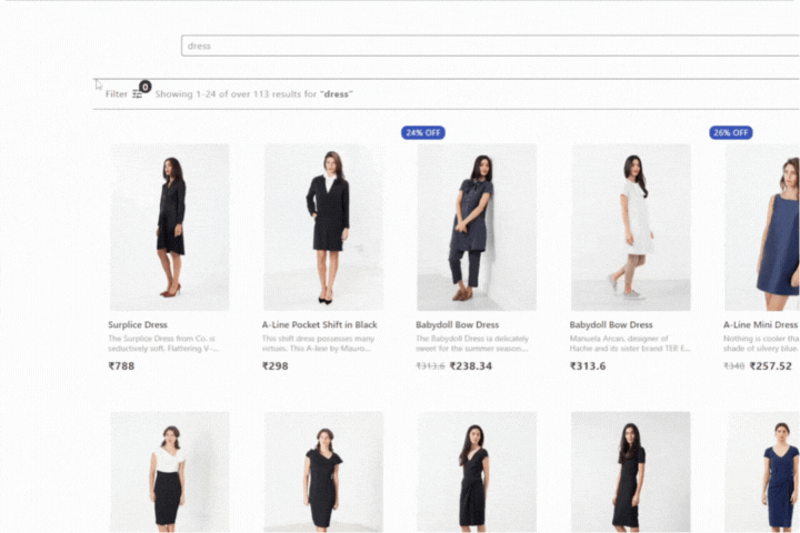
- At the Top – Filters show in a horizontal bar above the product cards. This layout saves space and feels smooth on mobile. It’s a good fit for stores with fewer filter categories.
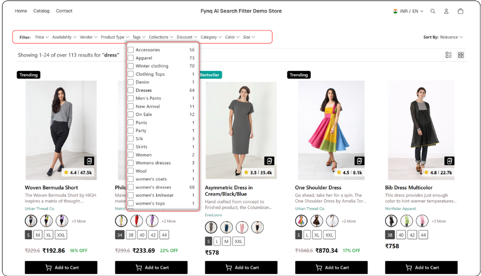
- Hide Filter – Use this if you don’t want to show any filters. It’s not common, but it might make sense if your catalog is very small or if you’re testing out a minimal design.
Once you select a layout in the Fynq app’s admin panel, you’ll notice a small label that says ‘Active’ next to your chosen position. That way, you always know what’s live on your store.
What layout is right for your store?
There’s no one-size-fits-all, and that’s the point. You know your customers best.
- If you sell fashion or anything in lots of sizes, colors, or styles, go with Left Sidebar.
- If your design is minimal and mobile usage is high, Top Bar might feel more natural.
The way is to test, learn, and apply. Change it up and see how customers interact. You can always switch back.
Wrapping up
Filters are how your customers guide themselves through your store. When they’re easy to spot and easy to use, people stay longer, click more, and buy more. Choosing the right layout is a small change that can make a big difference in how your store performs.
So, take a moment to test it out. See how it feels, and remember, you’re in full control.