 Fynq
Fynq How to Change Search Result Page Colors to Match Your Branding
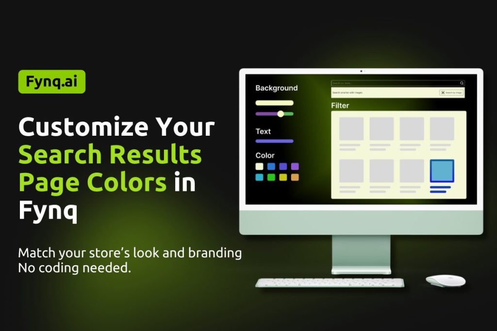
Your store’s colors are a big part of your brand identity. With Fynq, you can easily customize the Search Result Page to reflect your brand’s look and feel. Whether you’re going for minimal and clean, bold and colorful, or anything in between, this section gives you full control over how your search results appear to customers. No coding needed.
Fynq lets you fine-tune everything from background shades and text colors to button styles and filter tags; so, your store search experience feels 100% yours. It’s simple, visual, and highly customizable.
NB: If you’ve already chosen a compatible theme for your Instant Search Widget and Search Result Page, you don’t need to adjust the colors and styles manually unless you want extra customization.
Table of Contents:
- How to Customize Search Result Page Colors in Fynq
- Page Colors
- Product Cards
- Grid/List Product View
- Filters
- Filter Button
- “Apply/Done” Button (Mobile View)
- “Reset/Clear” Button
How to Customize Search Result Page Colors in Fynq
To begin, go to your Fynq Admin Panel > Configuration > Themes & Colors > Colors. You’ll find all the color and styling options organized in easy-to-use controls.
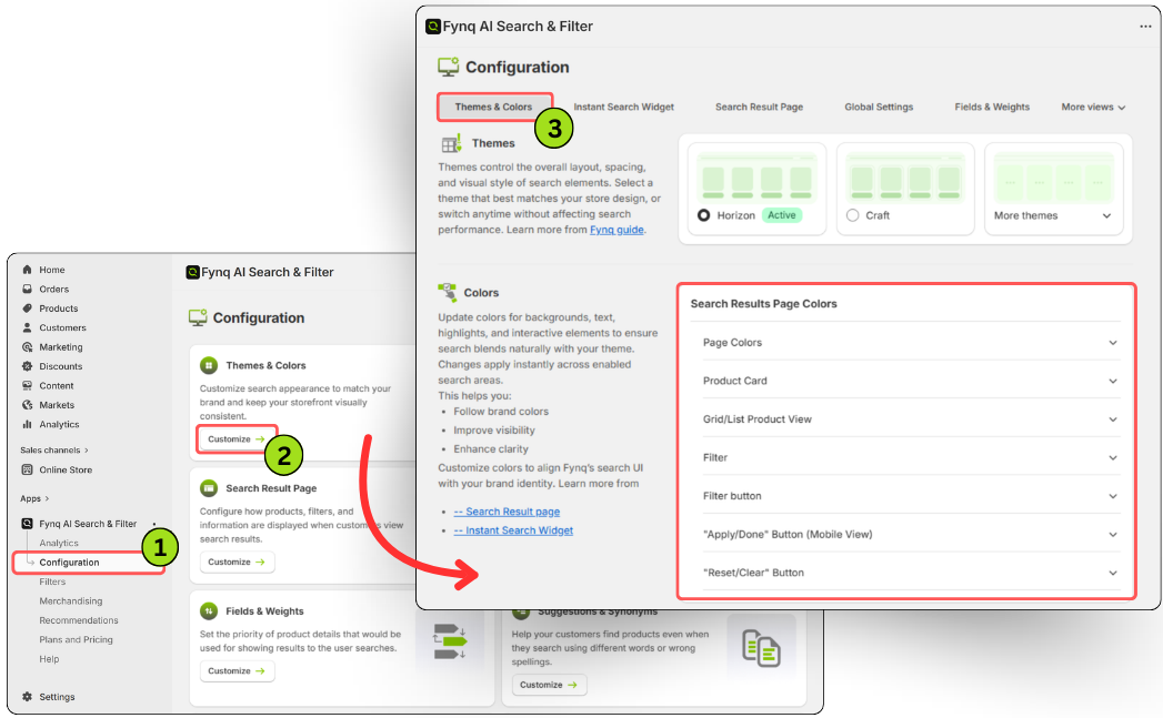
Here’s a breakdown of what you can customize:
1. Page Colors
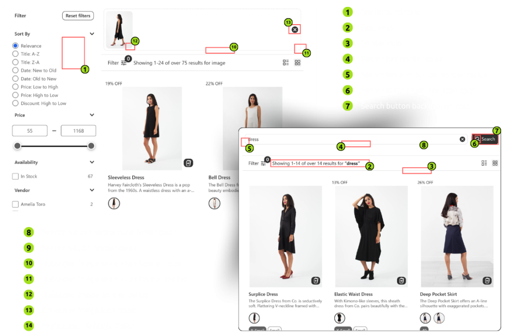
Set the overall visual tone of your search results. Know each element:
- Background color – Choose a solid color for the page background
- Text color – Adjust the color of regular text
- Border color – Set general border colors for layout elements
- Search bar border color – Define the search box border
- Search bar & button border radius – Round the edges using number values (The less the number, the less the corner becomes round.)
- Search button text and icon color – Change the color of the button text and icons
- Search button background color – Pick a solid color for the button background
- Search button hover color – Set how the button appears when hovered
- Search button border color – Border color of the search button
- Uploaded image search bar border color – Color for the image search input border
- Uploaded image search bar border radius – Control roundness of the image input box (The less the number, the less the corner becomes round.)
- Uploaded image border radius – Round the image corners (The more the number, the more the corners become round.)
- Cross and image icon color – Style icons inside the image search bar
- Pagination highlight color – Set the color that highlights the current pagination state
2. Product Cards
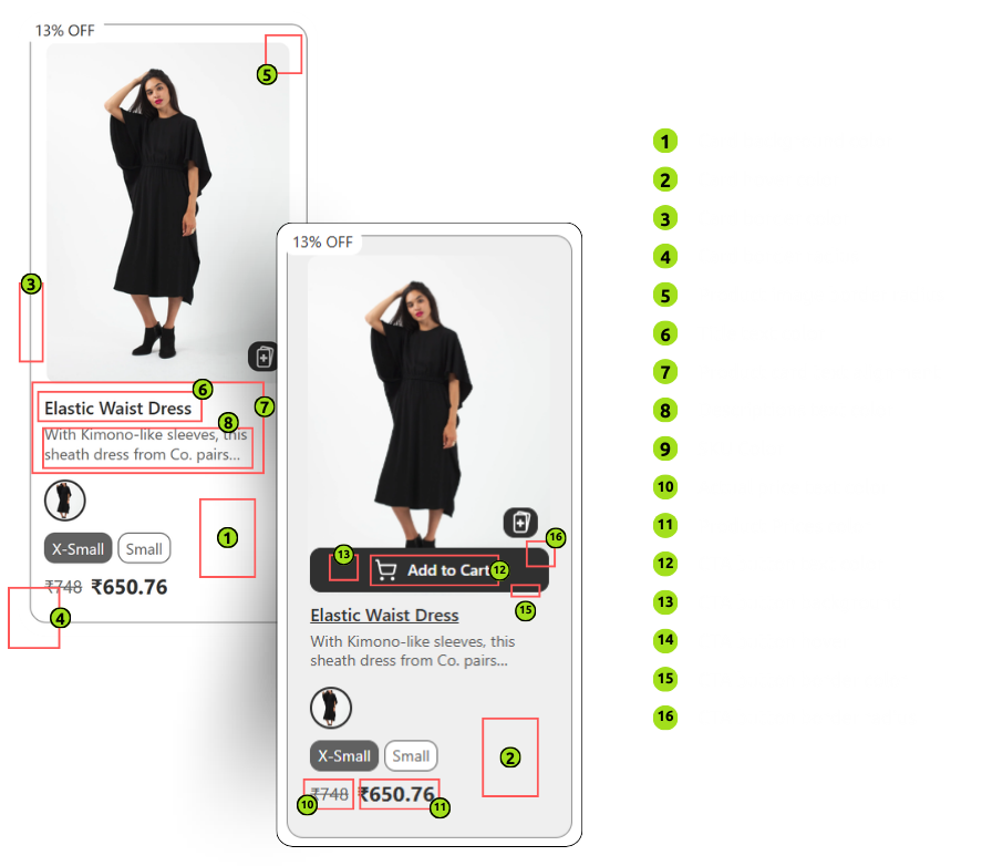
Customize how each product result appears in card format. Know each element:
- Card background color – Background color of each product card
- Card hover color – Background color when a user hovers on a card
- Card border color – Border color of each card
- Card border radius – Roundness of card corners (The more the number, the more the corners become round.)
- Product image border radius – Roundness of product images (The more the number, the more the corners become round.)
- Title text color – Product name color
- Product card text alignment – Align text (3 options available: left, right, or center)
- Description text color – Customize description font color
- SKU color – Style SKU information
- Actual price text color – Style the strike-through price
- Product price color – Color of the main product price
- CTA button text color – Style text on the call-to-action (like “Add to Cart”)
- CTA button background – Background color of CTA button
- CTA button hover – Color when the CTA button is hovered
- CTA button border color – Define the CTA button’s border color
- CTA button border radius – Control how rounded the CTA button is (The more the number, the more the corners become round.)
3. Grid/List Product View
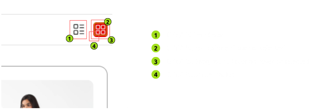
Tweak how grid and list view toggles look and feel. Know each element:
- Grid/List icon color – Color of toggle icons
- Grid/List icon hover or selected color – Style icons on hover or when selected
- Grid/List background color on hover or selected – Background color for selected state
- Grid/List border radius – Roundness of the icon container. (The more the number, the more the corners become round.)
4. Filters
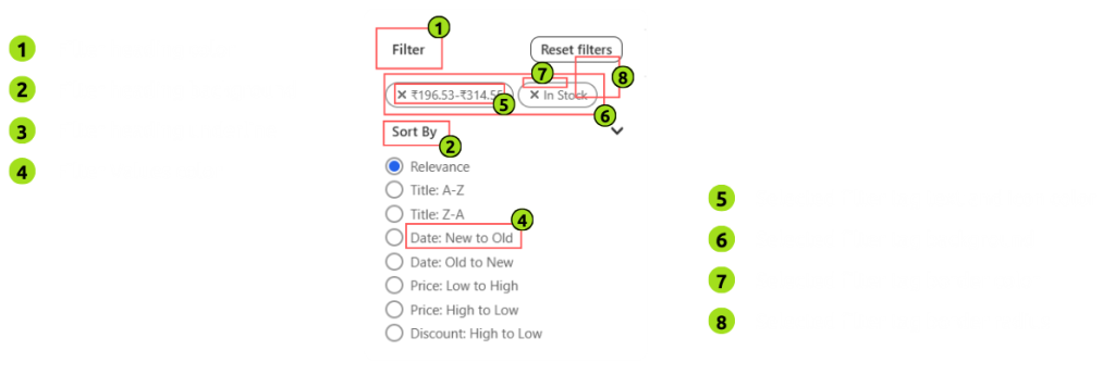
Give your filter section a consistent and branded look. Control the following:
- Filter heading color – Color of filter titles
- Filter heading background – Background of the filter title area
- Filter heading underline – Color of underline for headings
- Filter values color – Text color of selectable filter options
- Selected filter tag text and icon color – Color when a filter is selected
- Selected filter tag background – Background for selected filters
- Selected filter tag border color – Border of selected filter tags
- Selected filter tag border radius – Roundness of tag edges. (The more the number, the more the corners become round.)
5. Filter Button
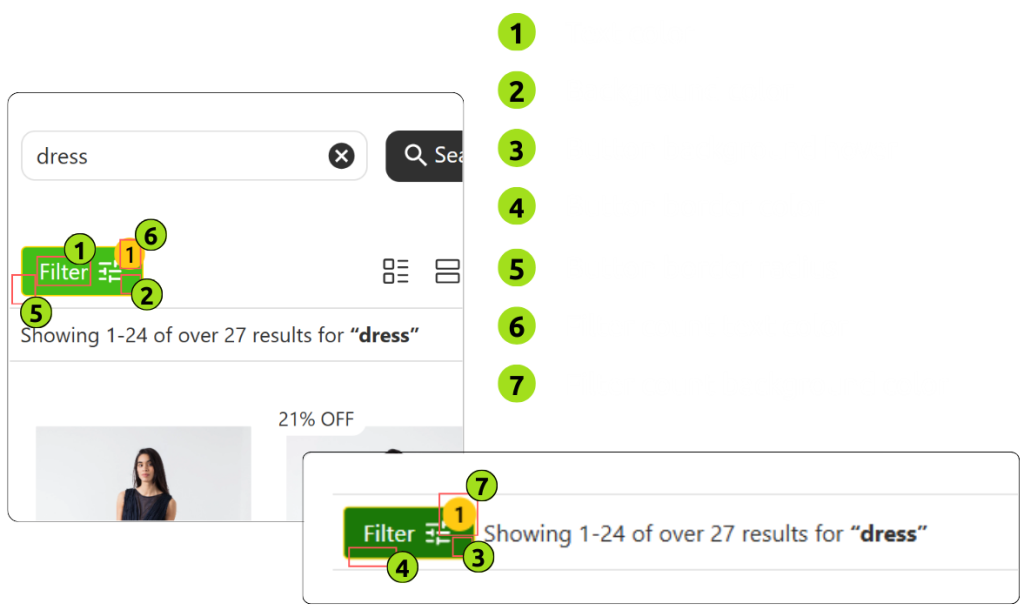
Customize the “Apply” or “Filter” buttons. Know each element:
- Text color – Button text color
- Background color – Main background of the filter button
- Button background hover – Color on hover state
- Button border color – Define button border
- Button border radius – Roundness of the button (The more the number, the more the corners become round.)
- Filter count text color – Color of the number displayed (e.g., filter count)
- Filter count background color – Background of the filter count bubble
6. “Apply/Done” Button (Mobile View)
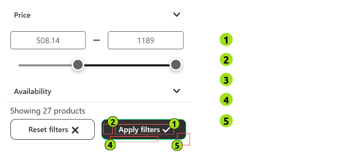
Control how the apply button appears on mobile devices. Know each element:
- Text color – Button text
- Button background color – Default background
- Button background hover – Color on hover
- Button border – Outline or border color
- Button border radius – Button edge roundness (The more the number, the more the corners become round.)
7. “Reset/Clear” Button
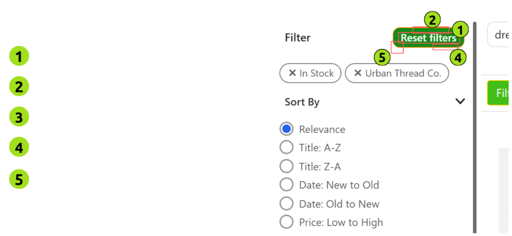
Style the reset or clear filters button. Know each element:
- Text color – Button text
- Background color – Main background
- Button background hover – Hover background
- Button border – Outline or edge color
- Button border radius – Roundness of the button edges (The more the number, the more the corners become round.)
Wrap-Up
Fynq gives you full freedom to match your Search Result Page with your store’s brand. This section is useful if you want to refresh your theme or are in the mood to initiate a seasonal update. Fynq Image & Search AI provides you with all the tools at your fingertips.
To style your Instant Search Widget, head to the next article: Applying color palettes to Instant Search Widget