 Fynq
Fynq How to Manage Product Cards on the Search Result Page
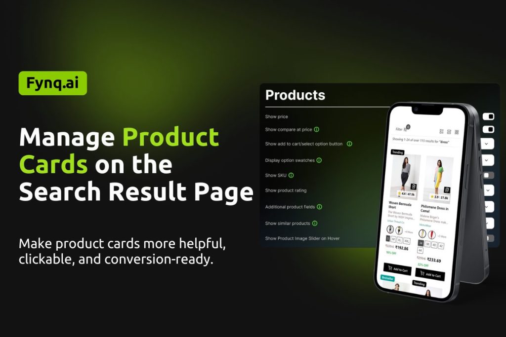
When shoppers come to the search results page after putting in some text or keywords in the search bar, the search result page consists of product cards. These cards show the basic details of each product: price, swatches, buttons, and more. Well-designed product cards help users make decisions quickly and encourage them to keep browsing or even add items to their cart right away.
In Fynq, you can fully control what shows on each product card using simple toggle and dropdown settings. Let’s walk through how you can make these cards work better for your store.
Where to find product card settings in Fynq
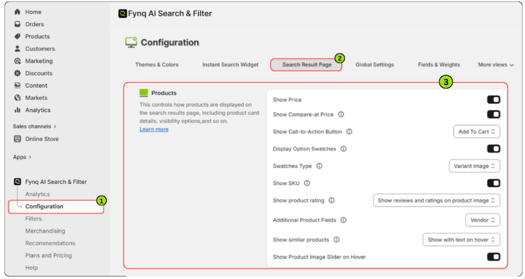
To manage what shows on each product card in the Search Result Page:
- Open the Fynq Image & Search AI app
- Go to Configuration
- Click on Search Result Page
- Scroll down to find the Products section
Now let’s explore each function one by one.
1. Show Price
This toggle lets you show or hide the product’s main price.
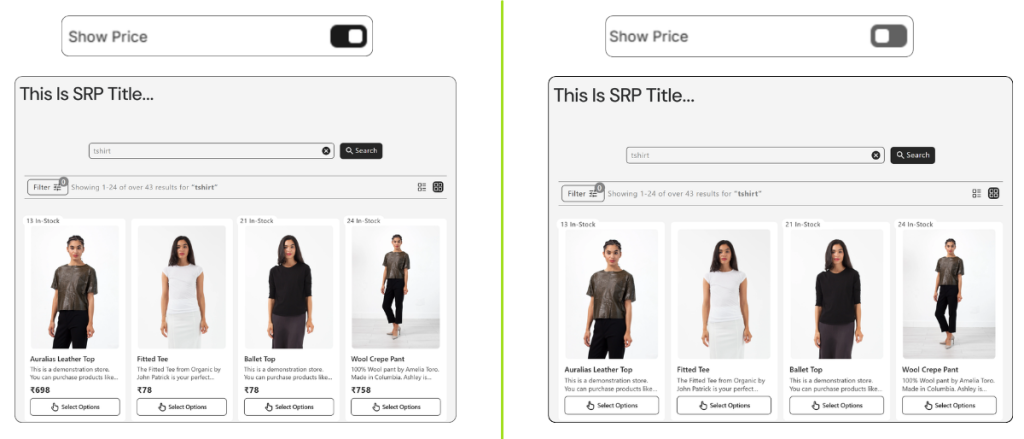
Why turn it ON:
Most merchants will want this ON. Showing the price upfront helps shoppers compare and make faster buying decisions.
2. Show Compare-at Price
This toggle shows the original price (the one you’re comparing against) alongside the current price.
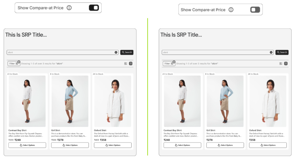
Why turn it ON:
This is useful during sales or promotions. It tells shoppers they’re getting a deal by visually showing the discount.
NB: To display discounts, Compare-at Price must be properly set in your Shopify inventory. Enabling this option in Fynq alone will not show discounts on your storefront unless the Compare-at Price is configured in Shopify. Please follow Shopify’s guide.
3. Show Call-to-Action Button
This dropdown lets you choose what kind of action button appears on each product card. Here are the options and what they do:
(i) None
No button will appear on the product card. Shoppers will have to click into the product page to take any action.
(ii) Add To Cart
A standard Add to Cart button appears directly on all product cards across desktop and mobile, making quick purchase easier.
(iii) View Product
A View Product button is shown to guide users into the full product page to read more before buying.
(iv) Add to Cart on Hover (Hidden on Mobile)
The Add to Cart button appears only when a shopper hovers over the card on desktop. It stays hidden on mobile devices.
(v) View Product on Hover (Hidden on Mobile)
The View Product button appears on hover in desktop view only. Mobile users won’t see this button at all.
(vi) Add to Cart on Hover (Visible on Mobile)
This adds an Add to Cart button on hover for desktop and keeps it permanently visible on mobile for easy access.
(vii) View Product on Hover (Visible on Mobile)
The View Product button appears on hover for desktop and is always visible on mobile for consistent navigation.
What to consider:
If your shoppers prefer browsing and comparing items quickly, “Add to Cart” or “Add to Cart on Hover” can be very effective. But if you want them to read product details before buying, “View Product” works better.
4. Display Option Swatches
Turn this ON to show color, size, or style swatches right on the product card.
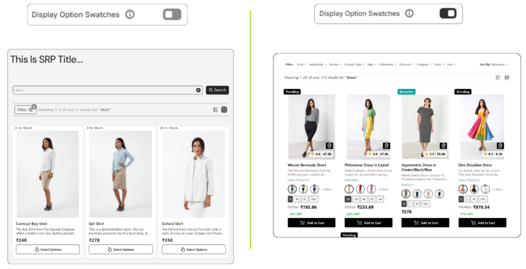
Why it helps:
This gives shoppers a quick look at available variations without clicking through to the product page. Great for fashion, accessories, or any item with options.
5. Swatches Type
The Swatches Type setting lets you control what appears inside the product swatch circles on the Search Results Page.
- This setting becomes available only when “Display Option Swatches” is enabled.
- Choose what customers see within each swatch to better represent product variants.
Available options:
- Color Swatch: Displays the variant’s color inside the swatch.
- Variant Image: Displays the variant’s image inside the swatch circle.
Use this setting to improve visual clarity and help shoppers quickly identify variant options.
6. Show SKU
This toggle allows you to display the SKU on each product card.
Why use it:
It’s useful for internal tracking, bulk buyers, or when managing large product catalogs.
7. Show product rating
This setting controls how reviews and ratings appear on product cards in the Search Results Page.
Note: This setting works only if a rating app is integrated from the Search Configuration tab. Know first how to integrate rating apps: Enable Reviews and Ratings apps integration.
Available options:
- Hide reviews and ratings: No ratings or reviews are shown.
- Show reviews and ratings on product image: Displays both on the product image area.
- Show ratings on product image: Displays only ratings on the product image.
- Show reviews and ratings on product card: Displays both within the product card content.
- Show ratings on product card: Displays only ratings on the product card.
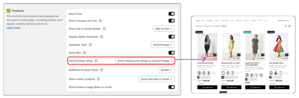
This setting helps you control the visibility and placement of social proof based on your store’s design and merchandising strategy.
8. Additional Product Fields
This dropdown lets you show one extra product detail in each product card. Options include:
- No (default)
- SKU for all variants
- Vendor
- Type
- Collections
Tip:
Pick the field that’s most helpful to your customers. For example, if you sell items from many suppliers, showing the Vendor could be helpful.
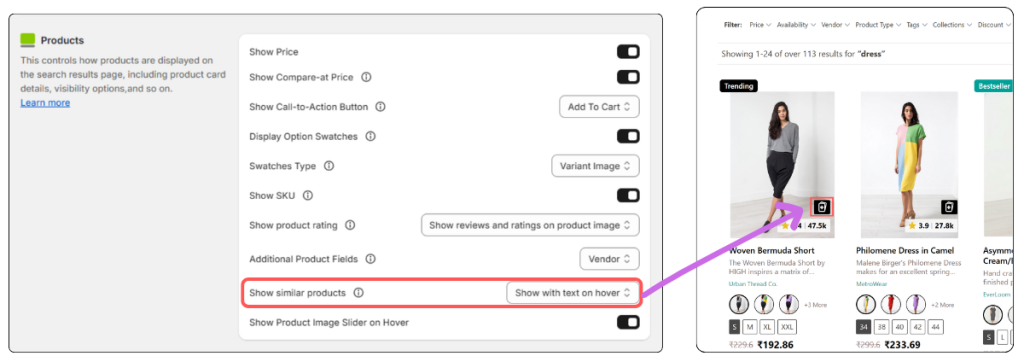
9. Show similar products
This setting allows shoppers to explore related products without leaving the search results page. When enabled, a Similar Products option appears at the bottom-right corner of the product image on each product card.
On click, a sliding panel opens from the right side, displaying products that are similar to the selected item.
The similar products are intelligently selected by Fynq AI using semantic and vector search, ensuring the results are contextually relevant, not just visually similar.
Available options:
- Hide – Similar products are not shown.
- Show with text on hover – Displays the option with descriptive text when hovering.
- Show without text on hover – Displays only the icon on hover.
Why it helps:
This improves product discovery, keeps shoppers engaged, and helps them quickly find alternatives, all without interrupting their browsing flow.
10. Show Product Image Slider on Hover
When this toggle is ON, shoppers can see a second image of the product by hovering over the card.
Why it helps:
This gives a better preview of the product without clicking in. This is very effective for fashion, decor, and lifestyle stores where visuals matter.
Note:
Don’t forget to click “Save” at the top of the page after making changes, or your settings won’t apply.
Wrap-up
Every detail on your product cards plays a role in shaping how shoppers experience your store. With Fynq’s easy-to-use controls, you can decide what to show, how it looks, and what kind of interaction works best, without touching any code.
Try different setups, keep your audience in mind, and use the toggles to build a search results page that really performs.